Data Visualization Techniques for Health Data Analytics
Understanding the Importance of Health Data Visualization
Data visualization plays a crucial role in health data analytics by transforming complex datasets into understandable visuals. This simplification allows healthcare professionals to quickly grasp trends and patterns that may not be obvious from raw data alone. In a field where timely decision-making can save lives, clear visual representations are invaluable.
Data visualization is not just a tool; it’s a communication tool that helps stakeholders grasp complex data and make informed decisions.
Moreover, effective visualizations can enhance communication among stakeholders, from doctors to policymakers. By presenting data visually, it becomes easier to share insights and foster collaboration in addressing health challenges. This shared understanding is essential for making informed decisions that can lead to better patient outcomes.
Additionally, visualizations can help identify disparities in health outcomes across different populations. By highlighting these differences, health organizations can target interventions where they are needed most, ultimately contributing to a more equitable healthcare system.
Bar Charts: A Simple Yet Powerful Tool
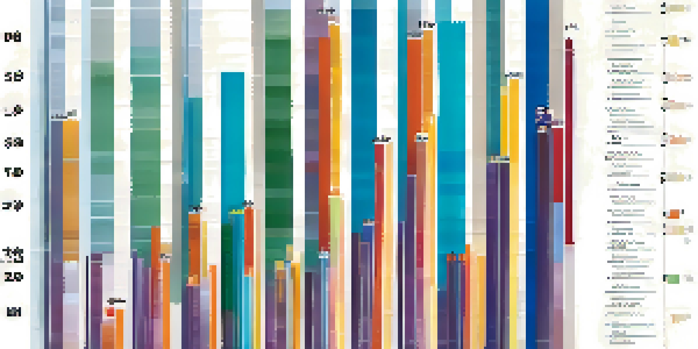
Bar charts are one of the most commonly used data visualization techniques in health analytics. They are particularly effective for comparing quantities across different categories, such as the incidence of diseases among various age groups. Their straightforward design makes them easy to read, allowing viewers to quickly identify trends.
For instance, a bar chart displaying vaccination rates across regions can reveal which areas may need more outreach. This type of visualization not only conveys information succinctly but also highlights areas of concern that require further investigation or action. By using color coding, these charts can also indicate progress over time.
Health Data Visualization Matters
Effective health data visualization transforms complex datasets into clear visuals, aiding quick decision-making and improving patient outcomes.
While bar charts are simple, they can become quite powerful when paired with additional data points or combined with other visualization types. This flexibility allows analysts to customize their presentations to suit specific audiences, ensuring the most relevant information is highlighted.
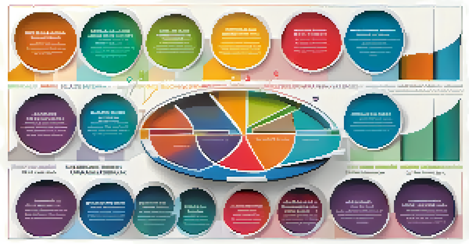
Pie Charts: Visualizing Composition in Healthcare
Pie charts serve as an excellent way to illustrate the composition of a whole, such as the distribution of different diseases in a population. They allow viewers to see how each category contributes to the overall picture, making them particularly useful for presenting demographic data or health expenditures. However, it's essential to limit the number of slices to maintain clarity.
The greatest value of a picture is when it forces us to notice what we never expected to see.
For example, a pie chart showing the types of health insurance coverage among a population can quickly communicate which plans are most popular. When used judiciously, pie charts can effectively highlight important proportions and persuade stakeholders to focus on certain aspects of health policy.
Nonetheless, overuse of pie charts can lead to misinterpretation, especially when slices are similar in size. Therefore, it's crucial to ensure that the data is appropriate for this type of visualization and that it complements other visual tools for a comprehensive understanding.
Line Graphs: Tracking Changes Over Time
Line graphs are particularly effective for tracking changes in health data over time, making them ideal for monitoring trends in disease prevalence or treatment outcomes. By connecting data points with a line, these graphs provide a clear visual representation of how a health metric evolves, allowing analysts to identify patterns and anomalies.
For instance, a line graph depicting the rise and fall of COVID-19 cases over several months can help policymakers understand the impact of interventions. This type of visualization can also facilitate forecasting by showing potential future trends based on historical data.
Choosing the Right Visualization
Selecting the appropriate visualization technique is essential for conveying your message and making data accessible to your audience.
In addition to displaying one variable, line graphs can be enhanced by adding multiple lines to compare different groups. This capability allows for a more nuanced understanding of how various factors may influence health outcomes, providing a richer context for decision-making.
Heat Maps: Uncovering Geographic Health Trends
Heat maps are a powerful visualization technique for displaying data across geographic areas, making them particularly useful in public health analytics. By using color gradients to represent different data values, heat maps can quickly convey information about health disparities in different regions or populations.
For example, a heat map showing the prevalence of diabetes across a state can reveal hotspots where interventions may be needed. This visual approach allows public health officials to allocate resources more effectively and tailor outreach efforts to areas with the greatest need.
Moreover, heat maps can be interactive, enabling users to zoom in on specific areas for more detailed information. This level of engagement can enhance understanding and facilitate more informed discussions about public health strategies.
Scatter Plots: Analyzing Relationships Between Variables
Scatter plots are invaluable for analyzing the relationship between two quantitative variables in health data analytics. By plotting individual data points on a two-dimensional graph, analysts can quickly identify correlations or patterns that may exist, such as the relationship between physical activity levels and heart disease incidence.
For instance, a scatter plot illustrating the correlation between body mass index (BMI) and diabetes risk can help healthcare professionals understand how these variables interact. This visualization not only highlights trends but also enables deeper exploration of causative factors.
Dashboards Offer Comprehensive Insights
Dashboards integrate multiple visualization types to provide a holistic view of health analytics, facilitating real-time monitoring and informed decision-making.
However, it's essential to complement scatter plots with context, such as trend lines or annotations, to help viewers draw meaningful conclusions. This additional information can guide decisions and promote further research into the underlying relationships.
Dashboards: Integrating Multiple Visualization Techniques
Dashboards are a comprehensive way to display multiple data visualizations in one place, allowing for a holistic view of health analytics. By integrating various visualization types, such as bar charts, line graphs, and heat maps, dashboards can provide actionable insights and facilitate real-time monitoring of health indicators.
For example, a health dashboard for a hospital can showcase patient demographics, treatment outcomes, and resource utilization all in one view. This consolidated information helps decision-makers quickly assess performance and identify areas for improvement.
Furthermore, with the rise of digital health tools, interactive dashboards allow users to customize their views and delve into specific data points. This flexibility enhances user engagement and supports data-driven decision-making in healthcare settings.
Choosing the Right Visualization Technique for Your Data
Selecting the appropriate data visualization technique is crucial for effectively conveying your message. Each visualization type serves a different purpose and is suited for various types of data, so understanding your objectives is essential. Factors such as the audience, the complexity of the data, and the key insights you want to highlight will guide your choice.
For instance, if you want to show trends over time, a line graph might be your best bet. Conversely, if you're aiming to illustrate proportions, a pie chart or bar chart could be more effective. It's always a good idea to consider the strengths and limitations of each visualization type.
Ultimately, the goal is to make your data accessible and engaging for your audience. By thoughtfully selecting the right visualization techniques, you can enhance understanding and foster more informed discussions around health data.